PLEASE VIEW MY PROFILE, AT THE BOTTOM THERE IS A LIST OF MY DIFFERENT BLOGS.
I START A NEW ONE FOR EACH PROJECT AND THEY ARE TITLED ACCORDINGLY (IN MOST CASES!)
CD COVER BRIEF
www.whichbrief.blogspot.com
FOR THE NEW ORANGE BRIEF I WILL BE USING
www.orangekerrie.blogspot.com
Friday, January 26, 2007
Monday, January 22, 2007
Group Work So Far
I am pleased to say that working as a group has far exceeded my expectations. I feel it is really benefitting my skills and sharing our ideas has lead to some really good outcomes so far.
I know I am coming up with ideas I never could have imagined without the discussions we are having. Bouncing our thoughts off each other and constantly trying to raise the level of the work, and consequently the performance of the group has been a great way of developing.
Also, the use of the group blog has been an absolutely invaluable tool for the development of ideas, including compromise and agreement on issues. Especially over the weekend, when everyone lives by different schedules, I have valued being able to leave posts at such unsociable hours when I return from work. So far, I am thouroughly enjoying the challenge!
THE DOORS OF MISGUIDED PERCEPTION______ The D.O.M.P [18th Jan - 25th Jan]
DURING THIS WEEK I AM WORKING ON A GROUP PROJECT, WE HAVE SET UP A GROUP BLOG FOR THIS SO I WILL BE ABSENT FROM MY OWN FOR A LITTLE WHILE...
The D.O.M.P's blog can be viewed at:
http://cradle2thegrave.blogspot.com/
The D.O.M.P's blog can be viewed at:
http://cradle2thegrave.blogspot.com/
Thursday, January 18, 2007
Collaborative Project - Professional Context
SEMESTER TWO - PROFESSIONAL CONTEXT
GROUP 8 - THE DOORS
After day one working together, this is a brief record of the possibilities that were discussed for each brief in idea generating sessions.
Brief One - 'A Day in Your Life'
All 6 people record a day of their life, obssessively. What they eat, in what order they get dressed in the morning, when they go the toilet'
This can be represented visually in whatever media suits each individual, creating a very personal response. This could also be a way of showcasing each persons design styles and interests.
Music, film, photography, bus tickets, observational drawing can all be part of a response to your day.
Following this, the group could come together again and swap days, then live someone elses day. You can record how this restricts your lifestyle, how you reflect on that person's day, and what things you just HAD to do differently.
This would be presented in a website with some kind of mapping format, following through six different days
Brief Two - 'Stuff-o-Meter'
We could create a screensaver of a 'Dad' character knocking on the screen that prompts the person to shutdown if it is not in use. This idea originated from the way my dad runs round the house switching off tvs, lights etc shouting "what do you think this is...Blackpool Tower?'
A screen saver with all six Dads knocking at the same time could become quite irritating and worth switching off!
This idea then developed into creating a gimmiky save energy pack to be sent out to house holds including stickers to put next to light switches etc.
Another idea... creating a systematic labelling system to go on electrical products to inform how much waste they produce, how efficient they are etc. Similar system to food labelling of salt content and fat.
Brief Three - NSPCC
A series of beer mats with facts about child cruelty displayed. These would be easily mass produced and cheap. It could raise awareness and cause the NSPCC to become a topic of discussion for men sitting at the pub table. We also talked about creating a beer brand called NSPCC, with it appearing on pint glasses etc, hypothetically for use in posters.
Brief Four - Orange
Short advertisement of people licking each others phones, resulting in faces of disgust. Only then they are pleasantly be suprised by licking an orange phone. 'Things taste better when orange' or some other relating tag line.
For the 'New Direction' section I suggested using something that is so set in stone in tradition that changing it in an orange way is an entirely 'new direction', for example the tomato throwing festival in Spain could be changed to oranges.
Brief Five - Horror Posters
We found this brief particularly difficult as it was a major factor to avoid cliches. It is difficult to represent the horror theme within just a type based poster. Imagery can only be a supportive tool. The ideas we came up with were pretty basic, using famous quotes from previous films such as 'here's Johnny' as the main basis for the posters. As it would be a Liverpool specific festival, we played with the word Liverpool. 'LiverFest' and 'Pool of Blood' were put forward, but we didn't come up with any ideas with much potential.
Brief Six - 15 ways to climate cool
Saturday, January 6, 2007
Sunday, December 31, 2006
Neville Brody
British designer and art director, Neville Brody, has been a prominent figure in graphic design for over twenty years. These examples, nominated in the D&AD awards 2004, I respect greatly. The type takes on a challenging yet balanced form on the page, and I believe the overall layout is superb. Information is ordered in an imaginary hierachy of importance, highlighted with perhaps a larger or heavier weighted type. Brody has integrated words and images incredibily well, by featuring a teasing snapshot from the main text alongside sillouhettes in the photographs.


David Carson
David Carson's work is also very inspiring for me. He boldly experiments with text orientation and legibility to create beautiful page constructions that are so great to look at, before you even begin extracting the information from them.

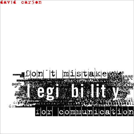
"David Carson continues to be one of the world's most distinctive typographic voices much imitated, but never matched,"_ Ellen Lupton, ID MAG judge, june 2005
"David Carson continues to be one of the world's most distinctive typographic voices much imitated, but never matched,"_ Ellen Lupton, ID MAG judge, june 2005
Wim Crouwell
We witness many attempts of poorly designed futuristic typefaces, whereas Crouwell's prove that he has ventured on a different thought process. His carefully considered shaped letters have a fresh appearance that separates from others, and they could be applied in a variety of ways. Having designed a typeface of a similar style for the recent 'Flatland' project, I appreciate and respect his guts in his approach. I found it difficult to push the boundaries of legibility and felt compelled to make my design snugly fit into the 'sci-fi' image of futuristic typefaces. Crouwell's work doesn't have to be pigeon-holed so sharply.


Stephen Farrell : An Opera In Flatland
I have selected a small example of Farrell's design work here as I wish to highlight the beauty of these book pages. The artistic sketchbook style typesetting featured has a very pure and emotionless feel. They are beautiful for their simplicity. 

TR_Start Creative, Martin Muir

Start Creative has worked with multinational comapnies such as Virgin Mobile. Virgin has a very striking corporate image that is different to other phone companies. This was an important part of the brief for Start as Virgin relies on it's media presence for success, as it has a very low profile on the high street. Start created a set of typefaces for the Virgin team to use on their own, this was a method of ensuring that the same brand expression was used in all features of design work.
"Using the simplest of techniques, type on paper, the manual inspires the Virgin workforce to think differently, take risks and be decisive."

TR_Norman Foster Works

This is an example of simple page layout for book design. Norman Foster's architectural work required a low key presentation so that there is no distraction from the visuals in the book, the most important piece of information and the purpose of the issue is to display his work. This is acheived by using a white background with light weight sanserif type to caption the images.

TR_Volkswagen Phaeton
www.thephaeton.co.uk/universe/index.php
This website is a good example of a succesful interaction with text and images. The white vectors creating the background link together the different aspects of the presentation, to create a whole and complete image to the viewer. Within the text, important words are highlighted as links to lead through to a different part of the site. The type used is discreetly futuristic, without appearing as though its been on a journey in Doctor Who's time travel machine. When you pass the cursor over the image, individual boxes appear with information about that part of the picture. Overall, I found this site very easy to use with a playful way of accessing information about this new car from Volkswagen.
This website is a good example of a succesful interaction with text and images. The white vectors creating the background link together the different aspects of the presentation, to create a whole and complete image to the viewer. Within the text, important words are highlighted as links to lead through to a different part of the site. The type used is discreetly futuristic, without appearing as though its been on a journey in Doctor Who's time travel machine. When you pass the cursor over the image, individual boxes appear with information about that part of the picture. Overall, I found this site very easy to use with a playful way of accessing information about this new car from Volkswagen.
Level Two Typo Project
"Typeset Shakespeare's Sonnet Eighteen in an appropriate font and layout with particular attention given to leading, kerning, and letter spacing. No fancy tricks, just beautiful composition. Think about the meter of these words, their subject and the voicing you intend the reader to perceive as they read."
I began my composition using 'Georgia Italic', reversed out in white on a mid-grey background. I altered the leading to 18pt as the body of text needed a lot more space in order to be read gracefully and slowly, as a Sonnet should. Before I changed the leading the tightness meant that a reader would be more inclined to travel at high pace through the Sonnet as though it was unimportant newsprint. A sonnet deserves consideration of its delicacy and meaning.
Eventually I progressed to using 'Adobe Jenson Pro', which I feel has a much more beautiful and precious style. It has greater legibility than any other type I used. I decided to abandon the grey box as it was an unecessary and confusing part of the composition that could not be justified. Setting the text with a right alignment in 12pt, and leading at 14pt was my final decision, positioned at the foot of the page in an overall central position.
MY PLAYTHING - Volleyball Match Analysis Animation
I aim to create a three dimensional model of a volleyball match that can be animated in flash. It will display the on court position of the points scored in a sample match, and their increasing frequencies. This will enable post match analysis for coaches and teams to determine where their weak points and strong points are with regards to conceding and scoring points. A key system will be displayed at the start to indicate the value of each different sized cone.

Once this general model is created I would envisage the flash file to become interactive, so it could represent an infinite variety of matches. With data recorded by a match analyser entered into a data input screen prior to the flash file loading, each individual game can be generated into a graphic visual movie.
This could be deemed extremely useful to volleyball teams. One person recording on a simple graph, as I did, could put the information into the data screen I have just described.
It would be programmed to show an animation of the data provided which can then be presented to the team to initiate a thorough post match analysis. It is an important consideration in this particular sport for members of a team to identify strong and weak areas on the court, in order to rectify the issues in later matches. Alternatively, this system will highlight the zones in which the team is succesfully scoring high points.
An extremely advanced level for this system could involve an impact triggered court or similar system which allows automatic feeding of data into the animation generator. This could potentially be utilised in high profile televised games to simplistically present the match analysis to a general audience, especially those who may not necessarily participate in the sport. Ideally, this would eventually lead to a universally understood visual presentation of match analysis.
Friday, December 8, 2006
Noodle Box Interactive Site

Noodle Box is a site produced by Daniel Brown at Amaze in Liverpool. I have been exploring the interactive site (see link) in great depth, and have found i've been enthralled for hours. A movable landscape of buildings is created, with each one containing a different game or animation through flash. I found this an exciting site, which didn't need any particular purpose except to be fun and enjoyable. A successful plaything!
Tuesday, November 21, 2006
Blast Theory - I Like Frank
An issue i'd like to highlight ... the first ever mixed reality 3G game. Using the streets of Adelaide, multi faced gameplay using
mobile phones bridged the gap between computers and reality.
Three months of careful planning by three members of Blast Theory, along with numerous local artists and scientists, culminated in a huge strategy hunt for a character named Frank. Online players received clues as photographs and moved through a virtual model of the city in search of numerous hidden clues.
Online players then had to recruit street participants via mobile internet to go and retrieve these clues that would eventually lead them to Frank, hidden in a leafy atrium surrounded by office blocks.
I find this game began with such a simple idea, and turned into a huge and wonderfully innovative game, one that could be enjoyed by thousands of people in competition with each other at the same time.
Tuesday, November 14, 2006
STUDIO TONNE - Paul Farrington Lecture

I see Paul Farrington as a symbol of somebody that has followed their interests an passions, whether they reap any rewards or not. His love of music and digital sound creation was visible from his early university work, with experimental sketchbooks exploring a computer's visual recording of each letter of the alphabet as it is spoken by him. This developed into some beautiful monochrome mark making.

Paul persevered with this idea ever since, and has carried it through to designs for Moby, Ford Motor Company, Penguin books and Sulphur. Mainly, Farrington produces fun and amusing sound based games for use on flash sites on the internet. I consider the Bip-Hop feature to be one of the finest. A present to the record label from Studio Tonne (Farrington's design company), the game is a fascinating construction of many coloured shapes which represent a individual sound. These shapes can be picked up, dragged, and placed upon four horizontal sliders. Playheads move along these sliders, and when they pass one of the coloured objects a variant of "bip" or "hop" is emitted.
Once the user has become accustomed to the controls, it is feasible that a decent sounding electronic score can be composed.
I was fascinated my Farrington's commitment to his interests and the scope of work he has ended up with. It is like a breath of air in a world of sometimes suffocating similar design. He has stuck to something he knows well, and probably better than anyone else.
http://www.pandemoniumrecords.com/bip-hop/news/machine.html
Subscribe to:
Posts (Atom)